10,000 search results
(0.051 seconds)
- Zebron by Fontron,
$35.00A bold, decorative, striped font for display and headlines. - Gothic Leavenworth by Wooden Type Fonts,
$20.00 Gothic Leavenworth, a display type, very bold, sans serif.
 - Triron by Fontron,
$35.00A bold, decorative, striped font for display and headlines. - Getaliss by Gatype,
$12.00 Getaliss is a casual script font suitable for a variety of projects, such as branding, invitations, merchandise, websites, advertisements, magazines and more. You'll get a full set of lowercase and uppercase letters, numbers and punctuation, multilingual symbols, ligatures, and extra strokes. Please message if you have any questions or concerns, and don't hesitate to say hello. Thank You!
 - LTC Spire by Lanston Type Co.,
$24.95 LTC Spire with alternate caps was designed by Lanston’s type director Sol Hess in 1937. Spire Roman was designed without lowercase. But it includes alternate rounded caps which transform this extra condensed “fat face” into more of an art deco titling face. Spire Roman has been used within department store logos, luxury hotel signage, perfumes, etc, etc.
 - Wood Sans Narrow JNL by Jeff Levine,
$29.00 Wood Sans Narrow JNL is based on examples of an extra condensed Hamilton Wood Type. The design was cleaned up a bit to provide more uniform stroke widths, but still retains the nostalgic feel of a tall, narrow type face found on broadsides and posters of the late 1800s. It is available in both regular and oblique versions.
 - Average Joe by Typadelic,
$14.95 Based on a mid 20th century retro typestyle, Average Joe is anything but average! You might even find that it breaks the rules and is somewhat of a rebel. Because this font has such a bouncy style, I've created extra characters for ease of flow when you type. Try combining upper and lowercase letters for a really fun look!
 - Haydon Brush by Mans Greback,
$59.00 Haydon Brush is a handwritten brush typeface. It is staunch and confident, the perfect type to use for a diagonal slogan or a logotype. The font contains ligatures, smaller case contextual and stylistic alternates, as well as a full upper case alternate alphabet. Designed by Måns Grebäck, it is guaranteed to give your projects the extra character it needs.
 - Lisa Bella by Wiescher Design,
$39.50 Lisa is an elegant script family in the tradition of early Italian type designers like Bodoni. I added counter strokes and floral embellishments to the font. Lisa comes in three variations: the beautiful Lisa Bella, the flowery Lisa Fiore and the extra swinging Lisa Piu (which means more in Italian). Enjoy! Your elegant script designer Gert Wiescher
 - Kampen by Talbot Type,
$19.50 Kampen is a minimal, modular, monospaced font. There are two variants, each available in two styles. The two variants — Block and Pixel — differ considerably in look, however the characters in both are designed using the same 7 x 7 square grid for capital letters, with extra squares above and below for accented characters and lower case descenders.
 - Conithing by Sulthan Studio,
$14.00 Conithing a very classy and light style handwritten font, with lots of characters in it, also complete with connectable hearts to make it more beautiful. Conithing font is modern, simple, but still authentic. You will get full set of lowercase and uppercase letters, numerals and punctuation, multilingual symbols, lowercase beginning and ending swashes, ligatures and extra swashes.
 - Neumartha by Zamjump,
$17.00 Neumertha is an imperfect ballpoint script designed to look as natural as a real handwritten note. Make sure you turn on the ligatures to see the magic as you type and unique extra swash. Great for handwritten quotes, notes, labels, wedding invitations, jewelry, or any project that requires an authentic handwritten touch. Included : - Symbol - Ligature - Ending lowercase swash - Swashes
 - Sidelle by Beary,
$15.00 Sidelle is an amazing hand lettering script that is attractive and natural. Every single letter have been carefully crafted to make your text look beautiful. This font is suitable for invitations, branding, advertising, classic design, poster designs, and more. This font is PUA encoded so you can access extras from character map in most design software.
 - Ex Libris by Fenotype,
$25.00 Ex Libris is a high contrasted Flared Serif font family in two weights. Ex Libris is a display type and it’s at its best in headlines, branding, packaging or as a logotype. Try adding some extra flair with Swash, Stylistic or Titling Alternates or wield any of Ex Libris’s 33 Discretionary Ligatures when typing in caps.
 - Roadster Script by Fontop,
$9.00 Welcome my new vintage style ROADSTER font family. With so many extras the font gives additional opportunities for logo creation, branding designs, blogs. Also looks cool when used in headers in signs, layouts, ad materials. OpenType features include swashes and dividers. To use swashes and dividers you need to press dot (.) followed by a number from 1-9 range.
 - Hachitos by Maulana Creative,
$11.00 Hachitos is a modern casual signature font. Hachitos included opentype features Ligatures and extra swash. Hachitos support multilingual more than 100+ language. This font is good for logo design, Movie Titles, Books Titles, a short text even a long text letter and any awesome project you create. Make a stunning work with Hachitos signature font. Cheers, MaulanaCreative
 - P22 Pop Art by P22 Type Foundry,
$24.95 This font set was developed for the Albright-Knox Art Gallery and is inspired by their collection of Pop Art. Artists such as Warhol, Lichtenstein, and Rauchenberg sought to blur the lines between high and low art as well as the boundaries between art and everyday life. The alphabets and extras in this set reflect that spirit.
 - Afferiants by Uncurve,
$25.00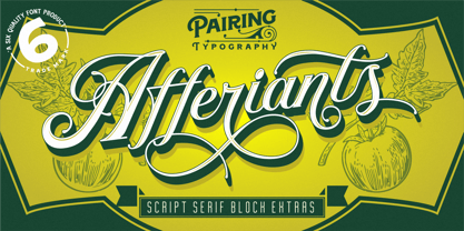 Afferiants is pairing authentic font collection. Thats already match up and to be use together. Afferiant support ligatures and alternates character to make everything awesome design. This Collection best use for vintage or modern design, logo, poster, advertising, branding, invitation, postcard, and more. The extras include badge, catchword and ribbon. Its make you more easier to combine.
 - Gulfs Display by Studio Sun,
$10.00 Gulfs Display Inspired by the 90's playful cartoon & comic books. This playful font comes in six widths; condensed, semi condensed, normal, semi expanded, expanded and extra expanded. This font can be used for modern and vintage designs, also can be easily paired with some graphic elements (Illustration, Photography) this font perfect for, Logotype, Branding, Title, and Packaging.
 - Nigel Roos by madeDeduk,
$14.00 Really excited to introduce Nigel Roos is a realistic signature to give a incredible impression for all your project design. Nigel roos come with two alternative with extra swashes and more than 140 ligatures in each font to make everything look realistic handmade signature. Included: Uppercase Lowercase Number & Symbol International Glyphs Multilingual Support Ligature Hope you enjoy it.
 - Muscleman by Big Typephoon,
$20.00A strong, heavy font that really packs a punch. Muscleman is there when your design needs a little extra lift. Originally created for a poster project, the font juiced up and grew quickly into the large fat size it is today. It works well for logos, posters, and t-shirt designs and has a slight deco look. - Lyps by hgo,
$15.00 Lyps is a contemporary headline family designed by Heiko Hoos. There are 4 font styles: Lyps Regular, Lyps Small, Lyps Extra Small and Lyps Wide. Each font file has OpenType features for ligatures, caps and some alternative Type variations. The Lyps family is suitable for high impact situations like posters, headlines, titles, magazines, packaging and many others.
 - Hostania by Attract Studio,
$17.00 Hostania is a beautiful and nostalgic serif typeface that looks amazing in both large and small settings as both display and body text. Best used as a showcase for titles and logos, sharp curves and a decorative alternative that give any project an extra touch of class. Includes: Alternative Styles Multiple Languages Supported PUA Encoded Characters.
 - Lisa Fiore by Wiescher Design,
$39.50 Lisa is an elegant script family in the tradition of early Italian type designers like Bodoni. I added counter strokes and floral embellishments to the font. Lisa comes in three variations: the beautiful Lisa Bella, the flowery Lisa Fiore and the extra swinging Lisa Piu (which means more in Italian). Enjoy! Your elegant script designer Gert Wiescher
 - P22 Da Vinci by P22 Type Foundry,
$24.95 The great Italian artist, inventor, and visionary Leonardo da Vinci created an extraordinary variety of work which continues to amaze those who study it. This set faithfully captures Leonardo's remarkable imagination and includes an exclusive Da Vinci Backwards font (reflecting the artist's own unique style of handwriting). The 72 extras included are drawn from Leonardo's sketchbooks and journals.
 - Calm Dawn by Epiclinez,
$18.00 Calm Dawn is the perfect horror display font for headlines, movie titles, and posters. Its cool, creepy style will surely give your product or service an extra boost of a scare! Calm Dawn font includes : Standard Latin All Caps Numbers, symbols, and punctuations Multilingual Support. Fully accessible without additional design software Simple Installations Works on PC & Mac Thank You.
 - Arnika by Typejockeys,
$50.00 This charming type family comes in four widths: Regular, Semi Condensed, Condensed and Extra Condensed – bringing flexibility and diversity to your drawing table. Crisp details convey confidence without losing fineness. Arnika is your ally for all things classy. Although it is a match made in heaven for beauty products and fashion magazines, we leave its usage to your imagination.
 - UT Sugar Cane by Uniontype,
$15.00 Sugar Cane by Uniontype is a fresh and light multilingual script inspired by vintage monoline fonts. It provides advanced typographical support with contextual alternates, ligatures and swashes. That way, you’ll have automatic access to the dozens of extra glyphs in each of the fonts. This font is good for menu, signs, packaging, posters, letterings and logos.
 - Brush Marker by Fenotype,
$18.00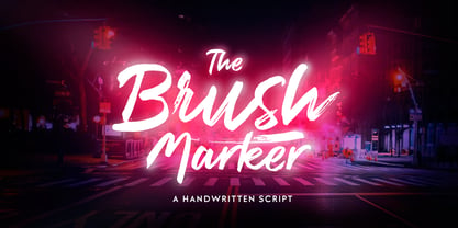 Brush Marker is a strong hand drawn dry brush font. Brush Marker is great for headlines and logotype use. Brush Marker is packed with automatic Contextual Alternates and Standard Ligatures that keep the text vivid. Brush Marker has a wide language support and it is PUA encoded so you can access extra glyphs in most graphic design softwares.
 - Lisa Piu by Wiescher Design,
$39.50 Lisa is an elegant script family in the tradition of early Italian type designers like Bodoni. I added counter strokes and floral embellishments to the font. Lisa comes in three variations: the beautiful Lisa Bella, the flowery Lisa Fiore and the extra swinging Lisa Piu (which means more in Italian). Enjoy! Your elegant script designer Gert Wiescher
 - Delighter Script by Uncurve,
$20.00 Delighter Script is simply perfect blended fonts with 3 style. Including 10 font and extras. Delighter is inspired from many lettering, poster, quotes, logos and brands. It's perfect for advertising, magazines, editorial, poster, branding, logo type, header, titles, packaging, display etc. A good combination for helping your design, just mix and match and you'll be very authentic.
 - Brush King by Subectype,
$17.00 Brush King is a supercharged, street-wise brush font bursting with energy, with extra attention to quick strokes and sharp details. This font is perfect for challenging jobs, titles, t-shirts, websites, hoodies, and various print and digital media with energy. Brush King is ideal for logos, apparel, quotes, product packaging, or anything which needs a typographic turbo-boost.
 - Bromley Hatch by Attract Studio,
$12.00 Bromley Hatch & Extras is a modern scripts with handwriting, decorative characters, and basic dance lines! designed to perfectly combine informal, sassy, romantic, sweet scripts, and hand-drawn design elements allow you to create many beautiful typographic designs in an instant, just in time for branding, logos, web design and editorial, branding, prints , invitations, crafts, quotes, and more.
 - Dubuffet by SAMUEL DESIGN,
$19.00 The name of this font is Dubuffet, named after a famous artist. The font style is distinct and unforgettable at the same time, showing a simple temperament. The extra thick strokes bring readers a warmer visual experience. The overall shape is artistic and literary. The serif uses a sharp shape that adds a youthful, modern vibe.
 - MTF Goodness Gracious by Miss Tiina Fonts,
$12.00 Goodness Gracious, it’s another font by Miss Tiina! This font is extra special with its cute handwritten characters and ligatures. It's perfect for adding a personal touch to your designs, it has a bouncy, playful feel that’s sure to bring a smile to your audience. Have fun mixing & matching upper and lowercase letters for a unique design.
 - Sofia Pro Condensed by Mostardesign,
$25.00 A geometric sans for space saving typography Sofia Pro Condensed is the condensed version of the popular Sofia Pro font family. This typeface was completely drawn with the look of the original normal-width version. Sofia Pro Condensed contains 16 styles from Ultra Light to Black (Ultra Light, Extra Light, Light, Regular, Medium, Semi Bold, Bold and Black) with an alternative glyph set to improve its use in different graphic contexts. This typeface will be suitable for many projects such as titles, subtitles, long editorials, brand building, mobile applications, ebooks, websites or company signage. Its contemporary aspect and its condensed style will also be suitable for editorial projects who needs to save space. Sofia Pro Condensed also has many powerful OpenType features such as case sensitivite forms, old style and tabular figures, ligatures, capital spacing, fractions and alternative characters to give personality to graphic design projects. Designed also for complex editorial content, this typeface has a powerful home kerning system called “Pro Kerning”. With more than 1500 pairs of glyphs in many languages, Pro Kerning optimizes headlines, subtitles, texts as well as long paragraphs in real time. In addition to all the features of its kind, Sofia Pro Condensed is part of a very complete “type system” with style variants such as the normal-width-version (Sofia Pro), the soft version (Sofia Soft) or the rough version (Sofia Rough). With all these typefaces, you have more than 40 styles to make your own vibrant and professional graphics or web creations while maintaining consistency in your creations. The OpenType features of Sofia Pro Condensed have an extended character set to support Central and Eastern European as well as Western European languages, Cyrillic and Greek. For more info about the powerful opentype features and the complete character map of Sofia Pro Condensed, download the PDF specimen to get a detailed view of all features.
 - Rockwell by Monotype,
$40.99 Whether you call them slab serif, square serif, or Egyptian, you know them when you see them – sturdy, nearly monoweight designs with blunt, straight-edged serifs and a no-nonsense attitude. The Rockwell® Nova family is a fine example of this appealing and eminently usable type style. This is a design that is both robust and adaptable. Marked by the flat top-serifs on the cap A, unusual Q tail and high-legibility two-storied lowercase a, Rockwell has a bit of handmade charm that distinguishes it from the cool, more modern interpretations of the slab serif style. The family is excellent for branding, headlines and other display uses. The simple shapes and hearty serifs also make it a good choice for short blocks of textual content in both print and on-screen environments. The light and bold weights are perfect for setting blocks of text copy, while the extra bold and condensed designs bring authority to display copy. Throw in a little color, and you amp up Rockwell’s messaging power. The regular and italic designs perform handsomely, in the most modest of screen resolutions. With four weights of normal proportions, each with a complementary italic, and three condensed designs, two with italics, the family is a commanding and versatile graphic communicator. Rockwell’s large x-height, simple character shapes and open counters, make for an exceptionally legible design. It should not, however, be set so tight that its serifs touch, as this will erode legibility and impair readability. A benefit to Rockwell’s slab serifs, however, is that the design combines beautifully with both sans serif typefaces and a variety of serif designs. Rockwell OpenType® Pro fonts have an extended character set supporting Greek, Cyrillic, most Central European and many Eastern European languages, in addition to providing for the automatic insertion of ligatures and fractions. Looking for its perfect pairing? Look no further than ITC Berkeley Old Style, Between™, ITC Franklin Gothic®, Harmonia Sans™, Metro® Nova or Frutiger® Serif.
 - Oxona is a futuristic sans serif with 4 weights , meticulously calculated square proportions that aims to redefine readability and visual impact. Every stroke, every curve and every angle has bee...
- East Anglia - 100% free

- Deutsche Zierschrift - Personal use only


